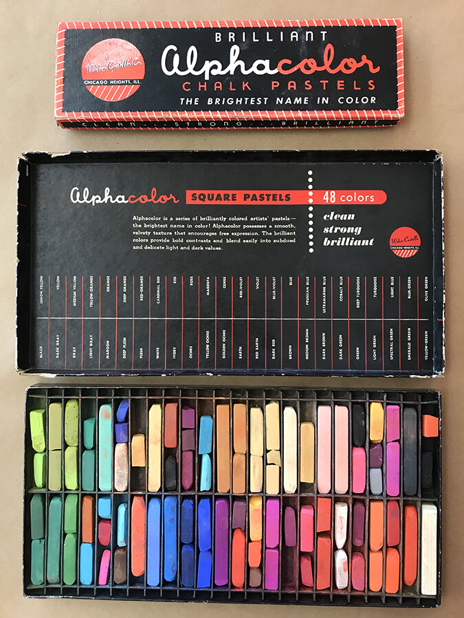
The weather has been so gorgeous, sunny and 70’s, no humidity, perfect for trail walking and podcasts! One of my go-to colors, besides green, is deep yellow. Mustard, goldenrod, Pantone 110 and beyond, all act like a neutral in my world. With other intense bright colors, it is happy and sunny. When paired with all values of gray and charcoal, it immediately becomes serious. I used a “muddy” version in my personal logo and my house is filled with this deep golden color, especially on my front door. Now that is true color love!
Vintage Supplies
In this age of Mari-Kondo decluttering, I often rescue cast-offs from the trash. The typography, printing and packaging is just so authentic and representative of the design of the time. The Alphacolor chalk pastels were manufactured by the Weber Costello Company in Chicago Heights, IL in the 1960’s. Still brilliant and usable, I love the infographic layout on the inside front cover. The music symbol flash cards were manufactured by the Kenworthy Educational Service company in Buffalo, NY. These date from 1963 but I have seen math flash cards they made using the same ink that date from the 1940’s. The graphic cards are printed green ink, 2 sided on heavy cream card stock and the symbols almost look like a foreign language. I am still thinking about how to use them! Frame all 75? Slice and dice and collage? Stay tuned…
Mood Boards
When I was younger I was always cutting out words and images from magazines, saving logo hangtags from clothes (ESPRIT was a fave), and collecting scraps of cool wrapping paper. I would glue them after arranging them by color or subject. I did not know then that was the beginning of becoming a “graphic designer.” Or that now that is what is referred to as a mood board or inspiration panel. I always have several in the works. The one that is in my design office is 40” by 112” and actually I don’t change it, just layer on top, all my favorites with greens (shown below). The one in my art studio is more the rainbow and filled with artist work. Then a final one I change seasonally. When I taught, students were always drawn to the diverse array of objects! From my daughters’s drawings to a vespa illustrated bottle cap top to a restaurant napkin, anything is fair game! This arrangement of images, materials, pieces of text, etc. always evokes a memory or sparks my imagination. It is also a good tool for starting the design process on a new project.
Coffeeshop Art
I love to stop in a local coffee shop when I travel. Besides trying the town brew and biscotti, the art displayed is usually by artists of the area. From black and white photography to oil landscapes, it really is a great way to get to know the neighborhood and surrounding countryside. While visiting Harrisonburg, VA, I visited Black Sheep Coffee located in the historic Ice House building. I was struck by the abstract beauty of these framed handmade, hand dyed papers. The deckle edge and thick cotton colors reminded me of my paper making classes in college. It made me think it’s time to get out the old pulp blender/mesh screens and make some paper!
Woodblock Type Art
I am always on the lookout for old woodblock type. It’s a nice connection to the history of graphic design and typography. At a great junqueyard in Michigan, I found 6 of these number blocks. I chose to work with their square shape and take 4 to assemble in a shadow box frame from IKEA. I love the warmth of the wood and of course, that they are framed to read reverse because of their function on a press. The other 2 sit on a shelf in my studio and are just a fun reminder of the pre-digital days!
Design Matters
When seeking inspiration, I love the visual of a book. But sometimes listening to designers speak about their process sparks my thinking. Debbie Millman is a writer, educator, artist, curator and designer known as the host of one of the longest running podcasts, Design Matters. Her podcast over the past 14 years has interviewed over 500 creatives from multiple industries on their lives, influences, and work. Luminaries in the design world from Kris Holmes the calligrapher and typographer to graphic designer Aaron Draplin of DDC to Scott Belsky, founder of Behance can be found on her podcast. I am working my way thru the list!
Wayfaring
When I walk a city, I love to spot logos on buildings. The scale and location is always a surprise as you navigate unfamiliar streets. Two of my favorites are from this summer. Velo Cycles in Holland, Michigan is a shop that sells, rents and repairs bicycles. The color palette of charcoal, B & W and vibrant orange is so sophisticated. Two bells is a historic tavern in Seattle, Washington. The primary colors are vivid and the rhythm of the hands moves your eye across the building until you spot the hidden two stars.
Pattern Play
The Irish fashion designer Orla Kiely, whose nickname is the Queen of Prints, has always inspired me. Her patterns play with color and scale and can be found in fashion, furnishings and accessories. This book is a great compilation of her vision.
Color Palettes
I found all my favorite colors traveling to Newport, Rhode Island. The “happy colors” I like to say, grays and greens, taupes and chartreuse. They evoke such a calm, quiet mood yet so beautiful. Amazingly, this shot of tiles in a Farmaesthetics store was spot on to the photo of the coast I took later that same day.